THE WEDDING STATIONERY
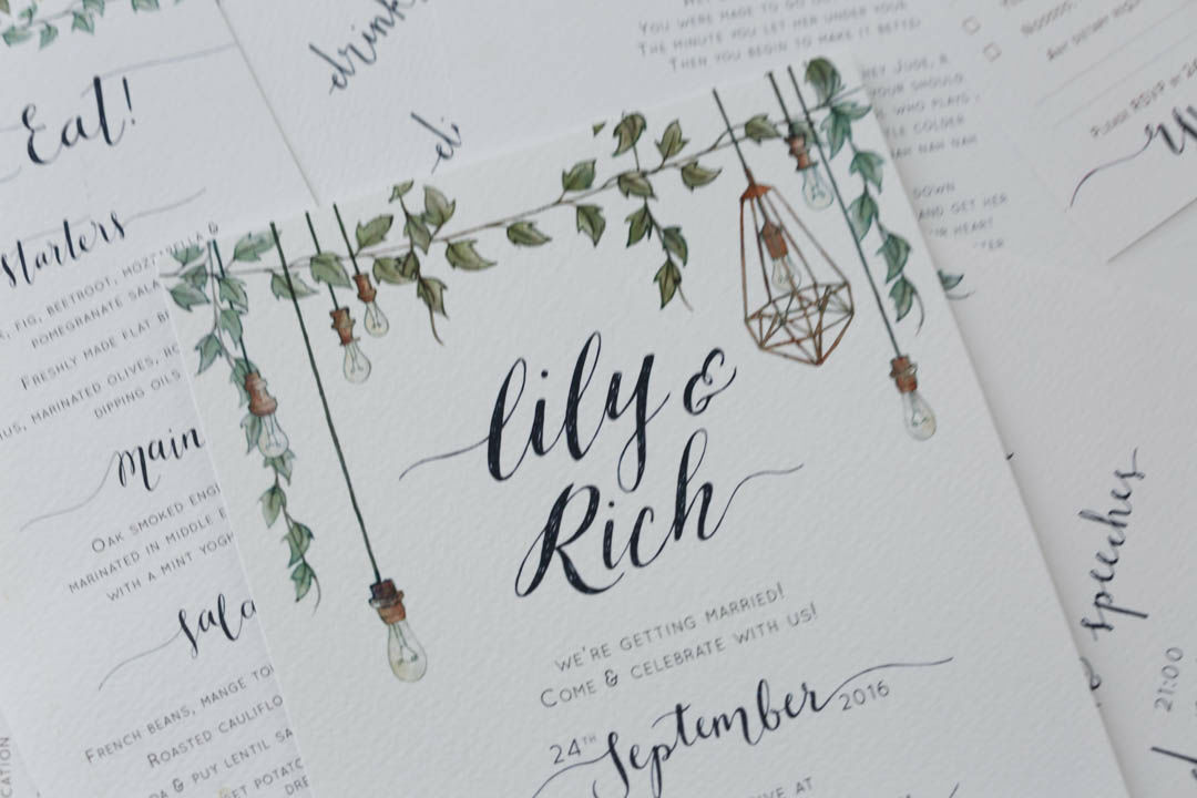
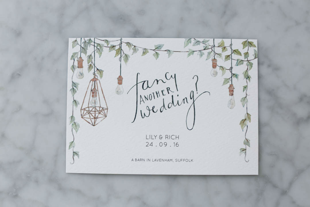
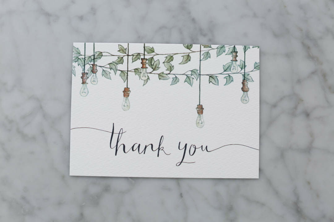
With the Internet being such a huge part of my life I think my friends and family were surprised I didn’t go for the online invitation option, but I’ve always been a huge fan of stationery so it was something I wanted to make special. We wanted to send out a “save the date” to make sure our guests kept it free so it was something we thought about quite early on. I thought it would be such a lovely and sentimental idea to use Olivia Whitworth as she created this illustration that Rich used to propose to me. He found her on a freelancer website and they had a couple of months of back and forth to work on a “will you marry me” illustration with drawings of all my favourite things.
A little bit about Olivia. She’s a freelance illustrator who originally trained in architecture, you can check out her website here. One thing I have to say is she was an absolute pleasure to work with. Throughout the whole process she was incredibly patient and we really became friends. She’s so talented and I would 100% recommend her for any illustration projects.
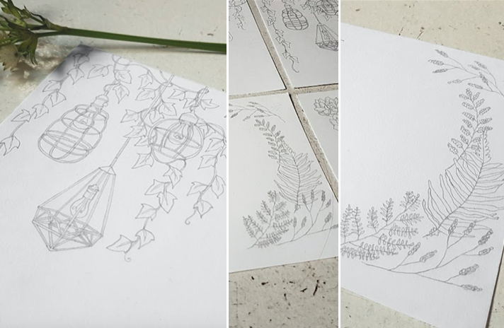
We started with the “save the date” and of course, me being me, I really dislike the term “save the date”. It just didn’t feel like something we would naturally say, so instead we went for “fancy another wedding?”. It was important for Olivia and I to nail the illustration at the beginning as we knew it could then be used throughout the rest of the stationery in different variations. I wanted it to reflect my vision for the venue… lots of greenery and hanging festoon lighting. I’ve posted some early illustrations below so you can see what we started with, I sent over lots of photos of the type of greenery, lamps and lighting that I like. We played with the idea of succulents but in the end we decided ivy worked best. The final illustration of ivy and festoon lights is so gorgeous and perfect for us. The drawings were first done in pencil, then scanned into the computer and coloured/touched up using photoshop. The colours were originally done as flat colours but were then brought out using photoshop brushes and texture overlays.
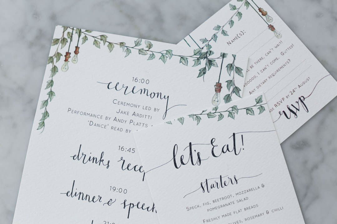
Next up was the invite itself and with this we sent an information card and an RSVP card. As it was a non-religious, non-traditional wedding we could write what we want and our parents are both very laid back. So we just wrote our first names and basic details of the day. The information card was where we could mention local accommodation, transport options, gift list, how we felt about posting photos online and of course, dress code. I’ve never felt strongly about telling people what to wear at my wedding, it seems strange to me, so we wrote “It’s a barn venue and there will be a very small amount of walking on grass. We just want you to be happy and comfortable so wear whatever you like!”. In case any of you are thinking about doing no dress code, I can confirm that everyone looked lovely and happy and I don’t remember for one second caring what anyone else was wearing. I say, go for it!
The RSVP card was pretty standard, although we wrote “yes, I’ll be there, can’t wait!” and “Noooo, I can’t come. Gutted!” instead of yes or no. If you decide NOT to print names on the cards, I’d recommend writing a small number on the back of each one that correlates with a spreadsheet as sometimes people forget to write their names on their RSVP cards.
There were just a few bits of stationery that we wanted on the day. The order of service was double sided with the lyrics to “Hey Jude” on the back for the singalong at the end of the ceremony. On the front was a list of the people in the ceremony and a rough outline of how the afternoon and evening was laid out. I didn’t want to give too much away but I also think it’s nice for people to have an idea of timings and not feel like everything’s a surprise. The menus were placed on each guest’s plate and instead of ‘menu’, we chose “let’s eat!” to encourage the casual, sharing vibe of our dinner.
So I hope you liked having a peak at our wedding stationery, let me know what you think! There are also some brilliant ready-made invites out there, so don’t feel you have to get your own thing designed, it’s definitely not essential.
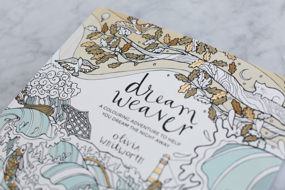
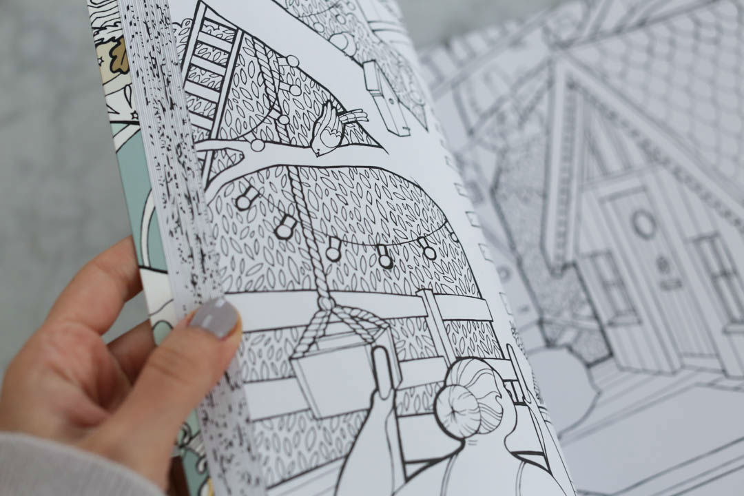
As I said, Olivia was so perfect to work with on this and I’m so grateful. I’m excited to hear that she has just released her first colouring book so I wanted to add in a few photos of that too! “Dream Weaver” is available now and unlike most colouring books, this one has a story of images to follow. The nameless woman, I like to call her Mary, drifts off to sleep and the book follows her dreams. It’s a gorgeous book that would make a really lovely gift too.
{ the early sketches for the stationery }
